Data Visualisation using R
Fursham Hamid
Lesson_intro.RmdWhy visualize data using programming language?
A myriad of data visualization software are currently available to generate beautiful graphs for the purpose of publishing, presenting or sharing data. While most of these software are intuitive and easy-to-use, programming languages offer superior advantages in which:
- It is able to handle large amount of data
- It could easily create reproducible publication-grade images
- It naturally incorporates statistical anlayses
- It drives you to think about data organization

Data structure for plotting
Almost everyone is familiar with using spreadsheets to easily create tabular data and intuitively generate simple graphs for visualization. Using a graphic user interface, spreadsheets make it possible to specify data values by selecting the desired “cells” containing your data. Although programming languages such as R and python do not offer the liberty of highlighting desired data values, it teaches us to effectively organize our data to facilitate data visualization.
The few most common data structures for visualisation of data include data-frames, matrices and lists/vectors. Do refer to this teaching material for details on these types of data structures.
Converting data for data visualisation
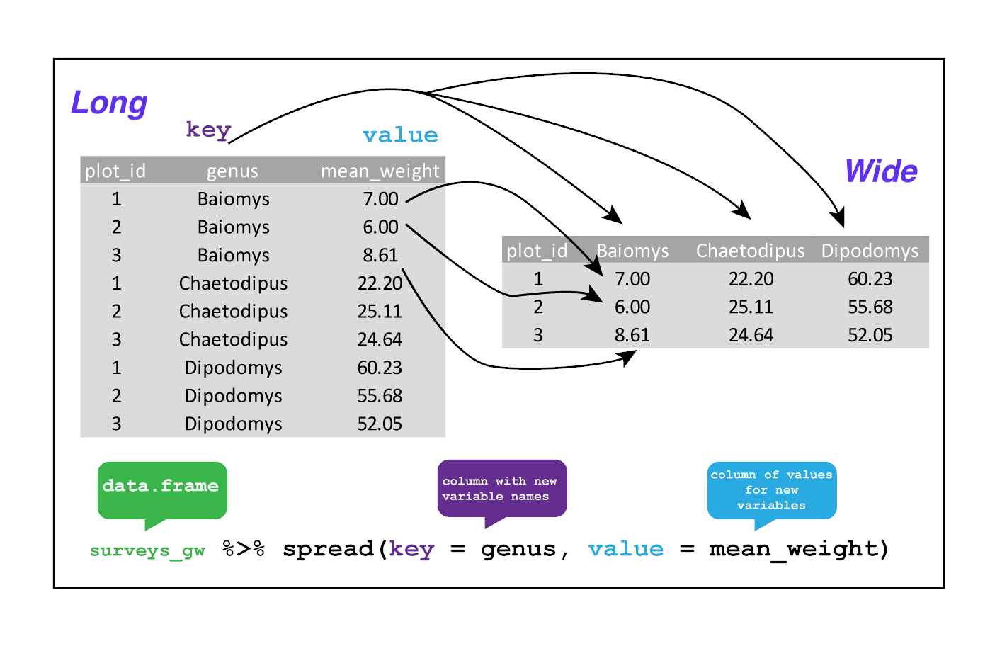
Sometimes, raw data can be in a format not desirable for visualisation. For example, we have a matrix with species names as columns and mean_weight at different timepoints as data as rows (see figures below). While this data structure is ideal for creating heatmaps, it is incompatible for creating line plots for of mean_weight across time for each species. Therefore, such wide-format matrices have to be converted to a long-format data-frame before a line plot can be generated.
The tidyr package contain 2 easy-to-use functions that can facilitate data reshaping. spread() converts data from a wide-format to a long-format while gather() performs the reverse operation. See the two figures below on the visual illustrations of the function and its usage. 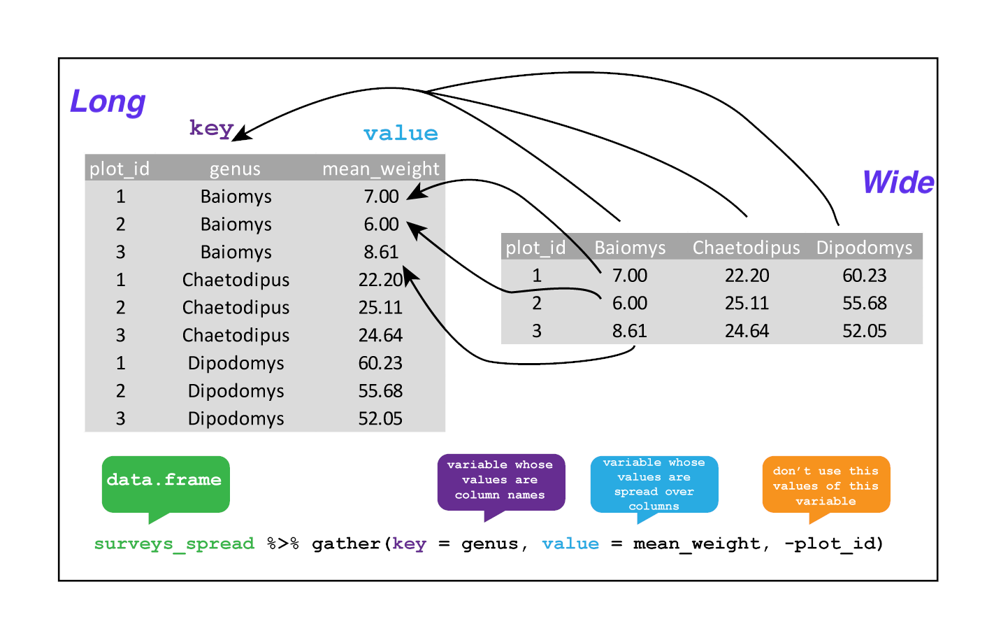
For detailed information on running these functions, see this teaching material. tidyr also contain a slew of other functions for data cleanup. You may refer to this cheatsheet for an overview of these functions.
R packages for data visualisation
-
Base R
- Easy to use for quick data visualisation
- Plots a variety of graphs with the ability to present confidence intervals
- Require some work to customize colours and data labels
-
Lattice
- Able to plot complex plots such as contour plots and 3d plots
- Steeper learning curve with the use of formulas
- Plots are visually pleasing but require some work for publication
-
ggplot2
- Highly popular package for its default image quality
- Highly customisable with a variety of function parameters
- Need practice
-
ggpubr
- Built upon ggplot2 framework
- Outputs even more visually pleasing graphs by default
- Labels statistical comparisons
- Limited type of plots
-
pheatmap
- Easy to use as compared to other heatmap plotting packages
- Pretty (pheatmap == pretty-heatmap)
- Slow, depending on the size of the data
-
ggvenn
- Built upon ggplot2 framework
- Easy to use with ability to draw complex intersections